 Whenever people ask how I approach social campaigns, they usually expect some kind of neat framework or “secret growth formula.” But the truth is, most of what works comes from a mix of boring operational discipline and a few habits I repeat every single time. Over the years I’ve developed a workflow that is simple enough to scale but strong enough to produce consistent results, even when I’m the only one running the whole thing.
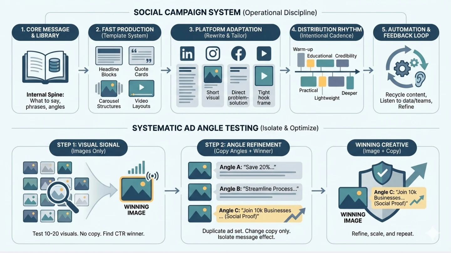
I always start with the message before touching visuals. If the message is not clear, all the assets just become noise. So the first step is building a small internal library: what we want to say, what the audience always misunderstands, the phrases that feel natural to repeat, and the angles that tie everything together. Once that spine exists, every caption, carousel, short-form video, and repurposed snippet becomes much easier because they all come from the same source.
After that, I focus on making production fast. Social campaigns collapse when every asset requires “design-from-scratch,” so I build a list of templates first, headline blocks, quote cards, explainer frames, carousel structures, and a few video layouts that can be reused. The goal is not to be fancy; it’s to make sure I can generate five versions of something without begging a designer for two weeks. (I am also pretty good at photoshop, Illustrator) Once the templates exist, the weekly workload drops dramatically.
Platform adaptation is probably where most people get lazy. I rewrite (I use AI to help me polish) almost everything for each channel:
- LinkedIn prefers narrative insights and slightly longer arcs.
- Instagram works best with visual pacing — short lines, clean frames, simple takeaways.
- Facebook likes straight-to-the-point, problem → solution content.
- Short-form video needs tight hooks and simple language.
The same idea across all platforms ends up looking completely different, which is how it should be.
I also treat distribution as an operational process instead of “posting when I feel like it.” I keep a rhythm: warm-up content, one educational post, one credibility post, one practical post, something lightweight, and then something deeper. When you stack them in the right order, the campaign feels intentional instead of random.
Behind the scenes, I usually build a small automation layer. New posts get recycled into newsletters, scripts, or BD enablement content. Good comments or feedbacks become topics or customer testimonial for the next month. (I also like to share good comments internally to credit the team) Anything that unexpectedly performs well automatically becomes a signal: expand it, rewrite it, record a video version of it. Social is much easier when you treat the data like a conversation you are listening to, not a scorecard you are chasing.
One thing that always helps is aligning with the teams who talk to customers directly. Their questions, objections, and “I wish people understood this…” phrases almost always turn into high-performing content. And when the messaging in social matches the messaging they use in emails and conversations, the entire experience feels consistent to the audience.
The metrics I actually care about are not flashy: saves, replays, comments with real questions, longer dwell time, and whether people share it privately. Those tell me the content was useful, not just loud.
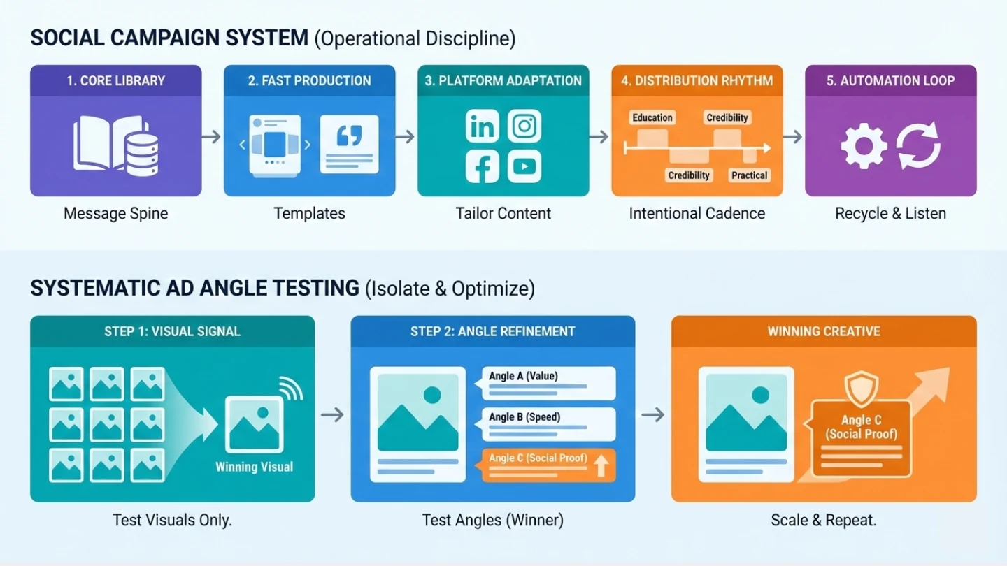
Over time, I realized that good social campaigns come from treating them like systems rather than isolated posts. Clear message → reusable structure → platform-specific execution → consistent distribution → feedback loop. It’s not glamorous, but it works. And once the system is in place, the creativity actually becomes easier, because you’re not reinventing the wheel every week.

What exactly is an angle? An ad angle is the core premise behind your message. the “why” of the ad. It’s not the image, not the headline, not the CTA. It’s the problem you’re solving and the emotional trigger you’re tapping into.
A great angle can 3x performance. A poor angle can kill a campaign, even if the creative looks good. And here’s the truth: the angle you think will win often doesn’t. The “boring” one sometimes outperforms everything else.
So instead of guessing, I test angles systematically.
Start With the Creative (Before Touching Messaging)
Before I test angles, I test images only. I usually start with 10–20 images, running small-budget CTR tests.
No copy variations. No angle testing yet. Only visuals.
This isolates what catches attention in the first place. Once I know which images pull the highest CTR, I lock in the winner and move on.
Small budgets are fine here — the goal is signal, not scale.
Then Test Copy Angles (Using the Winning Image)
Once the winning image is clear, I duplicate the ad set and test different angles by changing only the copy. This keeps the image constant so I’m isolating the effect of the message.
Example from a real campaign:
- Angle 1: “Save 20% on Cross-Border Payments.”
- Angle 2: “Streamline Your Payment Process in Minutes.”
- Angle 3: “Join 10,000 Businesses Trusting Our Payment Solutions.”
Angle 3 — the social-proof angle — outperformed the others by 15%.
Lesson: People respond more to credibility than to discounts or features.
The Creative Process (How I Generate Angles)
If the team is stuck on angles, I bring in PMMs, PMs, or anyone with deep customer insight. I also use AI tools to explore variants.
More perspectives → unexpected winners.
Example: For a B2B SaaS campaign, a freelance writer suggested the angle “Reduce your operational headaches.” Simple, but it hit the emotional core of the ICP and became the winning message.
4. Finding the Winning Creative (Image + Copy)
Step 1 — Identify the Winning Image
- Create your ad set and choose targeting.
- Build your first ad.
- Duplicate the ad 9–19 times, changing only the image.
This isolates which visual resonates.
Step 2 — Refine the Winning Angle
- Take the winning image and duplicate the ad set.
- Apply one angle per ad (each version identical except for copy).
- Run for three days at around $20 per ad set.
- Cut or scale based on early performance.
This gives you a clean read: Which image captures attention? Which angle converts that attention?
Frequently Asked Questions
What usually improves content SEO fastest?
Clearer search intent, stronger structure, and better internal linking usually move pages faster than simply adding more words. When the page answers the right question cleanly, search and AI systems have an easier time understanding it.
Where does AI fit into SEO and content workflows?
AI is most helpful in research, clustering, outline QA, metadata drafting, and consistency checks across a content system. It creates leverage when it shortens diagnosis and editorial prep without replacing strategy.
What makes a page easier for AI search to cite?
Pages are easier to cite when they answer a clear question early, use headings and lists that are easy to extract, stay current, and reinforce the topic through connected internal links and specific practical detail.
Related Expertise
If this topic overlaps with your work, these service pages show the operating systems behind it.
Related Reading
Explore a few connected notes if you want to go deeper on this topic.
