
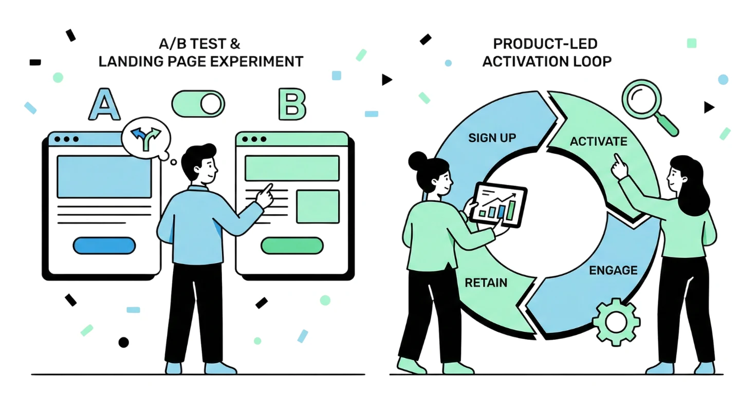
Landing page testing gets way too much theory thrown onto it. People love frameworks, heatmap philosophy, color psychology, and those diagrams that look like someone spilled Figma components on the floor. But in real teams, especially when budgets aren’t infinite and timelines aren’t generous, testing landing pages becomes a lot more human, a lot more scrappy, and honestly… a lot more about untangling the mess people created before you showed up.
For me, the real work always starts before any “test” happens. It starts with asking why the page exists, what promise the ad or source made, and whether the two things even belong in the same room. Most broken landing pages aren’t broken because the button is the wrong shade of blue, they’re broken because the visitor arrives with one intent and the page launches into a different monologue. Fix that tension, and half of your conversion problem disappears before the first test even runs. (Keyword: relevancy)
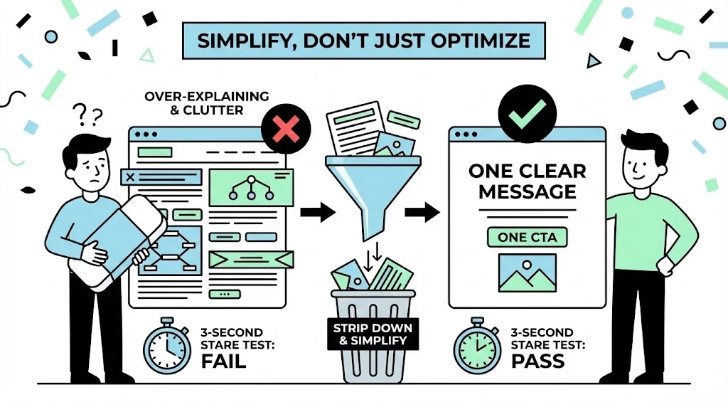
I always begin by simplifying. Not optimizing but simplifying. Most pages fail because they’re over-explaining something no one asked, or hiding the one sentence the visitor actually came for. So I strip the page down first: one CTA, one message, one clear thing above the fold that passes the “3-second stare test.” If someone needs to read the paragraph below the fold to understand what you sell, they’re already gone.
Once the noise is gone, I focus on the message itself. Landing pages are stories, and every story needs an angle (very important: an emotional lens that determines why the user should care). This is where testing actually becomes interesting. Instead of tweaking headlines endlessly, I test the narrative behind them. Is the user driven by efficiency? Security? Prestige? Fear of loss? Budget pressure? Compliance anxiety? Different angles unlock different behaviors, and a single strong angle can outperform the others by margins no UI tweak could ever achieve.
Only after the angle becomes clear do layout tests start to make sense. A page with poor messaging will always “perform poorly” regardless of layout; a page with a strong angle can survive even mediocre design. And interestingly, a lot of teams do this backward, they obsess over UI while never touching the part users read with their actual eyes.
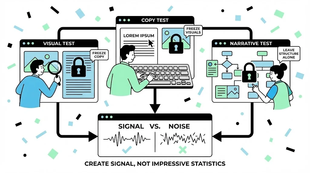
When I run tests, I try to reduce variables down to something survivable. If I’m testing visuals, I test only visuals. If I’m testing copy, I freeze the image entirely. If I’m testing the narrative, I leave the structure alone. This creates signal instead of statistics that look impressive but tell me nothing useful.
There’s usually one small moment in every test cycle where things click. For example, I once ran three angles for a fintech page—one around speed, one around cost savings, and one around compliance reassurance. Logically, you’d assume “save money” would crush the others. Instead, the compliance angle quietly pulled ahead, not dramatically, but consistently enough to tell me that fear, not price, was the true motivator for that audience. That insight changed not just the landing page, but the entire messaging direction for that segment.
After the angle wins, layout work becomes almost mechanical. Do we need a shorter page? Do we need proof earlier? Should the form float or sit still? Should the CTA follow the scroll or stay grounded? None of that matters until the psychology is right; once it is, these choices simply help the story get out of the user’s way.
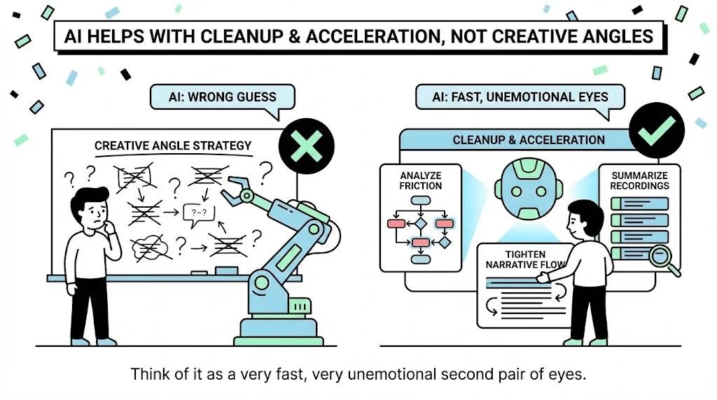
AI helps here, but only in the “cleanup and acceleration” phase. I don’t use AI to tell me what angle to pick—it rarely guesses correctly. But I do use it to analyze friction, tighten narrative flow, and summarize recordings or behavior patterns that used to take an hour to sift through manually. Think of it as a very fast, very unemotional second pair of eyes.
If I boil my process down into something that resembles a workflow, it’s embarrassingly simple. I look for intent mismatch, reduce friction, find the winning angle, rebuild the hero section around it, restructure the page so it reinforces the message rather than competes with it, and then polish the UI through small iterative tests. Nothing fancy—just disciplined curiosity, clear thinking, and enough patience to let a test run before I draw conclusions.
But the truth is, landing page testing is less about tactics and more about honesty: Are we saying something the user actually cares about? Are we showing it in a way that’s easy to understand? Are we respecting the promise that brought them here?
Everything else is just decoration.
Frequently Asked Questions
What usually improves content SEO fastest?
Clearer search intent, stronger structure, and better internal linking usually move pages faster than simply adding more words. When the page answers the right question cleanly, search and AI systems have an easier time understanding it.
Where does AI fit into SEO and content workflows?
AI is most helpful in research, clustering, outline QA, metadata drafting, and consistency checks across a content system. It creates leverage when it shortens diagnosis and editorial prep without replacing strategy.
What makes a page easier for AI search to cite?
Pages are easier to cite when they answer a clear question early, use headings and lists that are easy to extract, stay current, and reinforce the topic through connected internal links and specific practical detail.
Related Expertise
If this topic overlaps with your work, these service pages show the operating systems behind it.
Related Reading
Explore a few connected notes if you want to go deeper on this topic.