
Over the years, I’ve managed countless paid media campaigns, and I’ve learned that a well-optimized landing page can make or break your conversion rates. Today, I want to share my step-by-step approach to creating landing pages that not only look great but also drive real results. Whether you’re in fintech, B2B, or any other industry, these strategies will help you turn clicks into conversions.
Let me start with a confession: I used to think that more information on a landing page would lead to more conversions. it didn’t. In fact, some of my early campaigns had landing pages so cluttered that users didn’t even know where to click.
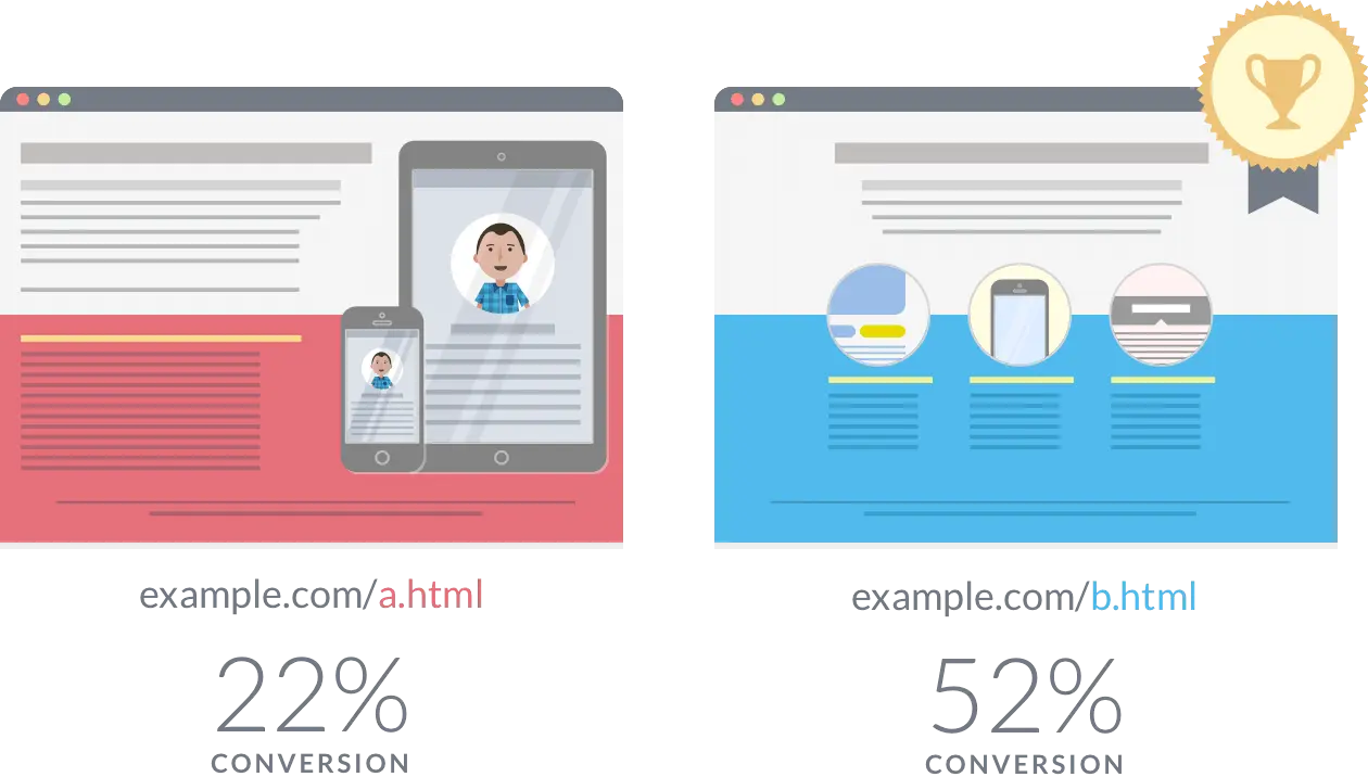
Now, I always prioritize clarity and simplicity. A successful landing page should be focused, lean, and direct. I make sure that the key messages, benefits, and CTAs are placed “above the fold”—within the first screen a visitor sees. This reduces cognitive load and has consistently increased conversion rates by 15–20% in my recent campaigns. Clean visuals, especially ones that match the ad creatives, also help tie everything together and create a seamless user experience.
Align Content with Visitor Intent is another important point. Understanding your audience’s intent is the cornerstone of effective landing page copy. I’ve found that the best-performing pages speak directly to the visitor’s pain points. Whether I’m offering a solution to a problem or a special deal, every sentence is laser-focused on what the user wants.
For example, in a campaign for a national home improvement client, we tailored the landing page content to highlight state-specific incentives. This small tweak made visitors feel like the page was personally addressing their needs, resulting in a 25% uplift in conversions. In the fintech space, I’ve seen similar success by emphasizing how our payment solutions can save businesses time and money.
The CTA is the most critical element of any landing page. I’ve learned that clear, visually dominant CTAs placed at the top of the page can significantly boost conversions. Instead of generic phrases like “Submit” or “Click Here,” I use action-driven CTAs like “Get Your Free Quote” or “Claim Your Discount.” In one A/B test, simply changing the CTA from “Learn More” to “Start Saving Today” increased conversions by 17%. The lesson? Your CTA should always tell users exactly what they’ll get by clicking.
Don't forget optimize for page load speed. Slow loading times can destroy your conversion potential. In my experience, a landing page that takes longer than 3 seconds to load can reduce conversion rates by 40%. I use tools like Pingdom to optimize speed, eliminating unnecessary scripts and compressing images. Speed optimization is especially crucial on mobile, where even a slight delay can result in massive click loss. For one fintech client, reducing the mobile load time from 3 seconds to 1.2 seconds increased conversions by 8%.
In addition, If my UA campaign use forms to capture customer information. Making sure to test and optimize forms. It’s important to strike a balance. While shorter forms can boost conversions, they might also result in lower-quality leads. For B2B fintech campaigns, I usually stick to the essentials: name, email, and company size. I’ve found that reducing the number of fields dramatically improves user engagement. In one campaign, cutting the form from 8 fields to 5 increased lead generation by 12%.
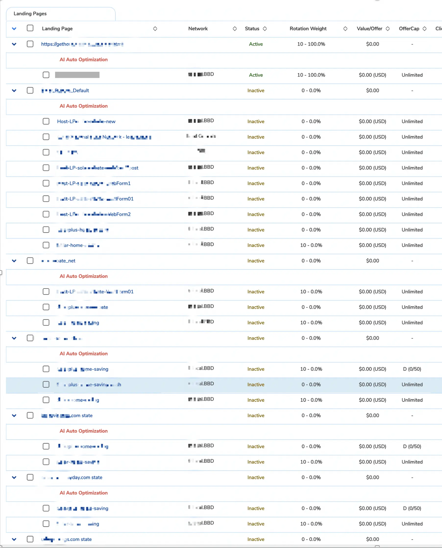
A/B testing is not a one-time task—it’s an ongoing process. For any type of campaigns, I typically allocate 10–15% of my traffic to testing new landing page variants throughout the campaign. Using tools like Google Optimize or Unbounce, I rotate multiple versions and refine based on performance data. For example, during a test for a financial services client, a landing page variant that emphasized customer testimonials above the fold saw an 11% higher conversion rate. These small tweaks can add up to big results over time.
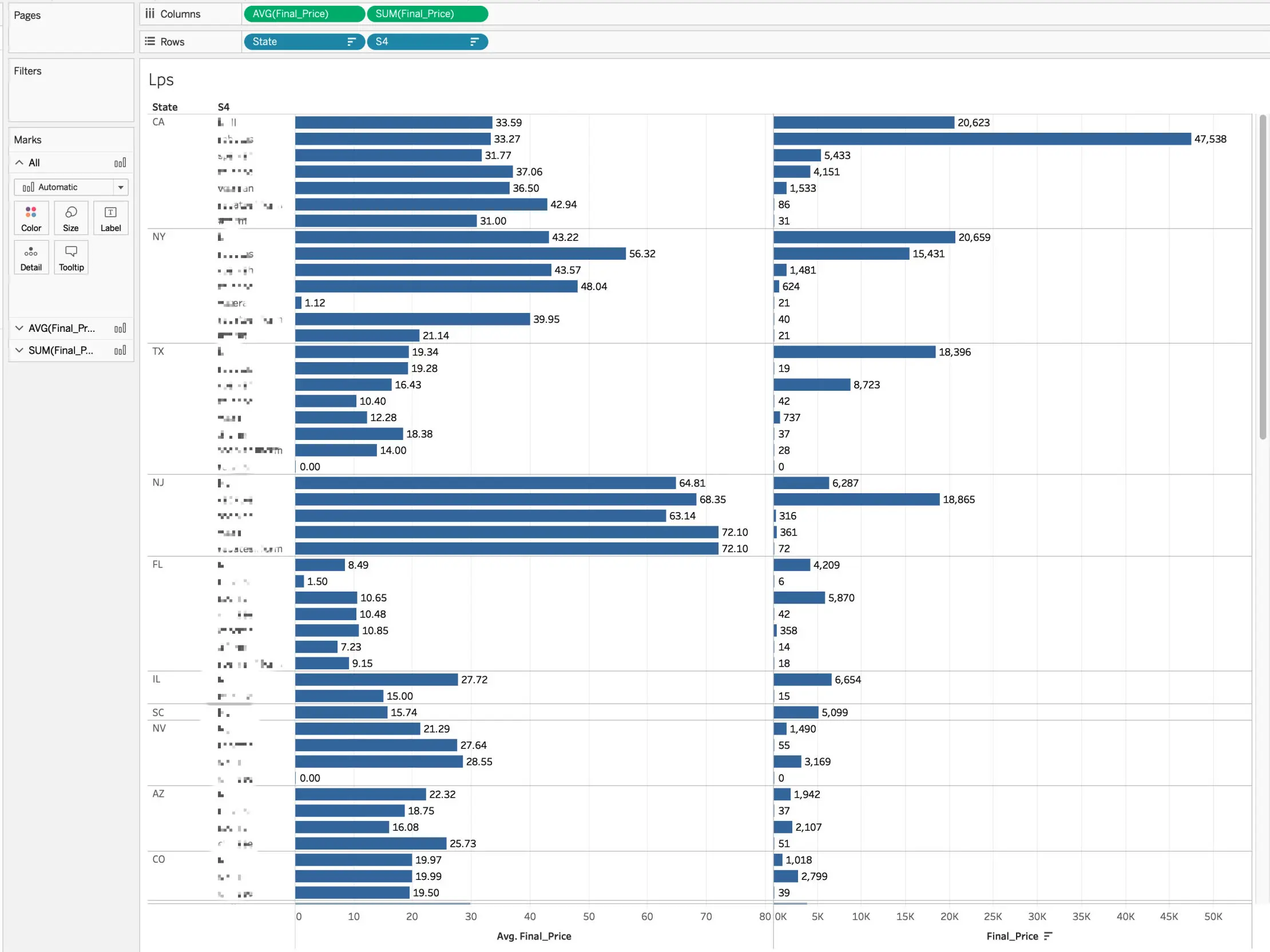
In one home improvement campaign targeting multiple states, I decided to test a new strategy of using state-specific landing pages. Each page highlighted localized incentives and tailored messaging. For example, in California, we emphasized solar energy rebates, while in Texas, we focused on hurricane-resistant upgrades. The result? An 18% increase in conversion rates and an ROI of over 100%! It was a game-changer (I made a few millions for the company), and it taught me that personalization isn’t just a nice-to-have—it’s a must.
Creating high-converting landing pages is both an art and a science. It requires a deep understanding of your audience, a focus on clarity and simplicity, and a willingness to test and iterate. Over the years, I’ve seen these strategies drive consistent results across industries—from fintech to e-commerce to B2B.